Showing posts with label art. Show all posts

Wednesday, February 26, 2014

January February Winter Post

Next release date: Unknown, but it's still far away.


 In an attempt to push out a monthly update, I'm going to try writing little posts every time I work, and then try to publish it all at the end of the month.  No promise this stuff is interesting, but hopefully it's better than silence.  Even with this plan, I've managed to already miss the Jan update, so this appears to be working great so far!


Gnome shopkeeper - He's coming along well enough.  It amazes me all the little things I struggle on that I "should" have been solved by now.  For example I only now realized that you can't have hair in front of the eye, as the eye is on a higher layer.  Wasn't a big deal for this guy, it was more of an accident really.  His eyes are bigger than normal, which made the problem more obvious.  I could add another layer just for hair if I really wanted, but he doesn't even have anything special going on with his hair.

Actually, pretty sure I did exactly this for the heros, come to think of it.

Also experimenting with hairy arms & legs.  Not sure if I like the hair matching his arm color or his head-hair color.  Hairy feet possibly incoming.  Originally he was going to be wearing bunny slippers, but not sure that gives the same vibe when he's in a village full of bunnykin.  Would it be weird to see human slippers in real life?

And I still don't have pants quite right either.  I may save that bitching for another post though.  Borderline nit-picking.


First actual monster finally added for real.

Holy cow, I had put off working on this guy because I didn't like how he looked, and also because I REALLY did not want to animate the tail for his slither animation.  Okay, I also didn't want to do an image search for snake dicks.  So many good reasons really.  Anyway, started working on him this month too.  He's actually in the game right now as a valid monster.  Yay milestone!  Okay, all he does is slide forward, and if he grabs you it switches to the bunnygirl sex animation because I haven't drawn one for him yet, but still he's there!  Totally counts.  ^_^

So many of you spoke up in favor of the double snake dong that it might as well be canon for snake monsters from now on.  I'm also thinking I will completely ignore "real" anatomy on this one & just draw what I feel like.  Nice thing about fantasy work, there's a LARGE grey area for "right" when it comes to snake, and I don't think too many folks will challenge me if I get it wonky.  So yay for that.

Also, those of you with sharp eyes will note that the hitbox for the snake actually follows his tail.  For some reason I think this won't actually work, but because he flips around so fast to face you, I don't think it will ever be an issue either.  I know it depends on which type of hit test I use, but it has been so long since I programmed that part I don't remember.  Fairly sure I used the 'good' one that would pick up on this.  I'm at least 40% sure of it.  =D


Around the Interwebs:


I'm late to the party on this one, but if for some reason you missed it, go check out the demo for Mogi Origins.  Developer's page is here, and offbeatr link to pledge money is here.  Demo looks really good, action seems solid, art is spot on, and I even liked the humor.  Sex may be a bit lacking, but I'm willing to be optimistic there.  Looks like there's plans to add several new girls, here's hoping it all comes together.


What have I been doing you ask?  I've been playing Skyrim with a mod called Sexrim.  You may remember I both loved & hated the sexmods available for Fallout3, mainly because Sexout didn't work & I was forced coble together outdated mods instead.  Well, it looks like that team gave Skyrim the same treatment, and the results are surprisingly good.  They do a fantastic job with some of the tougher details like alignment & facial expressions.  It's not perfect by a long long way, but the improvement over the other sex mods I've tried is just astonishing.  If you're sitting around waiting for TESO to come out, go fire all this up & give it a try.  The path to getting all of it working is long & poorly documented, but it is worth the effort.

DirtyC101


Friday, May 3, 2013

May Update: Snake. SNAAAAAAAAKE!!!!

Is it bad that the dude screaming "SNAAAAKE" at the game over screen is the only thing I can recall about the Metal Gear franchise?  Well, that, and running around under a cardboard box.  


My Game: 
Next release date: Too far out to even guess yet.

That said, I have (almost) finished the background for the first of the two zones in Act 3.  That's a big milestones to me.  The game becomes more than just a pile of parts, & I can actually walk around & explore.  It also means it now takes longer for me to run around & debug, but that's a problem I'm glad to have.  haha.

I should probably water down the above statement a bit.  Yeah, the backgrounds for the beach level are done, but only the backgrounds.  There's nothing to interact with yet, so it's really quite boring at the moment.  Hell, there's even a few places in the background where I have placeholders because I'm too lazy to draw the details.  hahaha.  But even so, I've passed that marker when the game world starts to feel like a game world.  That's cool.

I've seen a lot of requests for more NPC sex, and there's even places where it would fit on the beach level, so I'm going to try & include some.  We'll see if we like the results.  I'm honestly a bit torn, as it takes just as much effort to add NPC sex as it does to add monsters. The monsters add more gameplay though, so they're a better use of my time.  Then again, hey, sex game.  Any sex I add is a good use of my time.  hahahah.


Speaking of, here's the first actual monster from the new level.  As always, drawing is not my strong point.  Please feel free to help me deconstruct or to offer any pointers on how to touch him up.  (Is it wierd that I kinda like posting my own art, because I suddenly see all manner of terrible flaws once I press that publish button?  hah)

I purposely made the fingers extra long because I thought it would give a neat, almost sinister look.  It kinda works at a quick glance, but if you look twice you see the proportions are out of whack.  I think the palms need to be wider, which might allow me to extend the fingers too?  Anyway, I may take another swing at it, but fuck, I hate drawing hands so much it may just have to float as is.  hahah

Also not quite happy with the head.  It's serpentine alright, but as a whole it just doesn't click.  I think I may have the whole head too tall, possible the eye is too far back as well.  Or perhaps the back of the eye needs to be rounder?  Anyway, more things to tinker with.


This also brings us to one of the more entertaining parts of my blog.  I haven't planned out any sex poses for this guy yet.  If you are feeling creative, here's a good place to offer suggestions.  It'd be cool to involve the tail in some manner, but not necessary.  

Don't forget the rules from last time - he gets four poses in total.  At one end the hero should be dominating the grapple, while at the other he should be dominating, and there's two more positions in between.  The four poses should all be related, and only the very last pose should involve penetration below the waistline.


Around the interwebs:
No new games really caught my eye this month.  The only big news I saw was on Offbeatr, where Fenoxo proposed a new game idea and generated more than $100,000 in pledges.  That's some serious dough!  I suspect all the amateur game makers are going to come out of the woodwork shortly.  With luck, there could be a flood of new porn games posted by late this year.  Looking forward to that.

Til next time
DirtyC101


Update: Right after I posted this I found out that Kyrieru posed his new game Eroico.  I haven't played it yet, but I loved the last one.  By the time next month rolls around though this will be really old news, so thought I'd drop a quick bump here.  If you're a fan of pixel porn, go check it out.  Demo is free, and the whole game is only $5.


Sunday, April 7, 2013

April Update: How not to draw skirts

My game:
Next Release: Don't know yet.

So been drawing new armors for the game.  It's going well enough, although I find that I can spend a whole week & still not finish a single one.  In particular, I couldn't get the balance between sexy & armor right for the new wizard robes.  I've redone the whole thing at least 4 or 5 times now, and still not sure I'm going to keep what I have.  Which brings me to today's topic.  It really bothers me how I still can't get dresses or skirts to look right.  You might notice they're always the first thing to get torn off.  It's because they always look wrong to me in at least one of the possible poses.  So I make a point of removing them first.

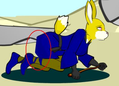
For whatever reason, it finally dawned on me today that the reason they look wrong is because they aren't hanging like they should.  I don't have a separate clip for the lower half of the armor.  It's either tied to the torso or tied to the legs.  So when the hero crawls or lands on her back, the skirt still points straight back rather than following gravity.  In the past I've worked around this by deleting certain tracelines & smearing colors.  It works most of the time, but if you catch certain frames you'll see it looks really wrong. For example:


The picture on the left isn't so bad.  The skirt height in the rear doesn't quite cover the rear leg though.  If you're looking, you see it.  The problem is the same skirt height looks really stupid when she's crawling.  See the picture on the right.  What's that triangle doing sticking of her butt?  Hhaha.

Okay, maybe this is a silly thing to bitch about, but it's one of those things I've been trying to work around for a while now.  For each outfit with this problem, I've tried a slightly different approach.  And each time it's had some problems.  So I think this is really just a reminder to myself - Next game, I need to include a separate sprite just for the lower armor.


I'm still slowly making the backgrounds.  It's a nice way to waste time when I have like 20 minutes to kill & don't feel like doing anything ambitious.  I have run into a strange problem though.  There's a few spots where the 'path' on the ground isn't nice & straight.  For example, here's one where it opens up into a little clearing.  It's supposed to blur the dirt lines into the grass, and it appears to do so in the editor.  But when I actually play the game, the blur doesn't show up:


No idea what's causing that.  I'm sure it's something stupid I should know, but for the life of me I can't remember what. 

Oh, and you can see the red lingerie set from the elvin ladies in that last picture too.  Someone requested I make it.  It wasn't planned, but I already had the boots drawn, and I needed stockings & gloves for the new wizard armor.  At that point making this set was just applying some color swaps, so I figured I'd go ahead & knock it out.  (See, I totally listen to fan requests.  When they're easy.  hah!)


Around the Interwebs:

Toffi released Melly 2 last month.  After several complaints, he released an easy version.  This really strikes home to me.  How do you balance the difficulty in a game where you lose to see the reward? Should the difficulty be really high, so that the players get to see all the sex scenes?  Or should it be really easy to beat, in which case the players have to replay & lose on purpose to see the fun stuff.  That's backwards from where a game of skill ought to be.  Perhaps sex games aren't meant to be games of skill?  (Or it's the skill of playing 1 handed - lol!)

I personally liked the way he handled this problem.  There's was a cheat mode already built into the game.  It gives you infinite lives and it lets you skip levels.  In my mind this is even better than a gallery mode, as you still get to see the animations you want, but you get to play the game too.  Anyway, folks still complained that this was too hard, so he released an easier version.  In fairness, the original difficulty is hard by being downright cheap sometimes.  I'd often see a fast monster run up behind a slow one & get me before I could fire twice.  I assume that's in there to force the occasional sex scene?  Glad to see the sex, but not when I feel the game is cheating.

Anyway, one of those things that we have to keep balancing.  Glad to see I'm not the only one who's thinking about it.

-DirtyC101


Sunday, March 3, 2013

March Update - Ho ho ho, Green Giant!

Don't sweat it if you don't get the title, just means you didn't watch enough American commercials in the 90's. 

My Game:
There's 3 stages of poison severity in my game.  You'd have to try really hard to get past the first stage in the current release, but most of the basic mechanics for all three are there.  There's a section in Act 3 where the 2nd & 3rd poison levels are much more likely to occur.  I wanted a more visual cue to help distinguish between the three.  So I've been playing with adding a green tint to the hero's skin.  As you might imagine, this had some comical results until I got it right:


Supposed to be poisoned, instead she came out kinda hot.  Well, if you're into green chics anyway.  haha.  Anyway, after an afternoon of mucking around, I realized two very important things.  Crankin the green up gives ya bright green skin (like above).  If you want a darker/sickly green color, you really want a green in the middle of the spectrum. 

The other thing is that you don't so much want to amp the green.  What you want is to mute the other colors.  Muting blue seems to be more important than muting red BTW, although I'm not quite clear why.  I'm still using my preschool knowledge, which says blue + yellow should get me green, but here I already have green.... bah, whatever.  Anyway, tone down red a little & tone down blue a lot & you get some really nice dark greens.  Probably obvious to anyone who's looked at a RGB color palate, but the obvious isn't always so obvious when you're working.  heh.


When I left off last month I said I'd be working on drawing backgrounds.  All true, and making progress there too.  Backgrounds aren't terribly exciting imo, but here's a sample of one of them:


I've got most of the trees & grass built, so from this point making the backgrounds should just be a matter of plopping down vegetation until I'm happy.  The water's not so great though.  Probably needs more than just a single solid color.  Simple gradients aren't cutting it though, and I don't want to add much more detail.  I want to keep the backgrounds simple - especially for something that you can barely see.  So I dunno, something for me to play with some more.


Around the Interwebs:
Okay, there really wan't much to catch my attention last month, so going to talk about something slightly different.  One of my fantasies is quitting my day job to do this full time.  Don't get too excited about that, it really is just a fantasy to me.  I actually kinda like my day job.  Anyway, a more realistic dream might be to get good enough at making games to make it a second source of income.  Might even motivate me to work on my games on a regular basis.  ha!

I'm not much on setting up stores, begging for sales, and I downright detest DRM.  So the idea of selling finished games has always been a no-go for me.  But recently there's been this new push from sites like Kickstarter.  If for some reason you haven't heard of Kickstarter, the idea is you pitch your games when they're still ideas or demos.  If folks like it, they donate a few bucks.  Mutiply this by every bored person on the web, and you have the potential for a fully funded game.  I think it's a fascinating idea, although not without it's own set of flaws mind you.

In my case, the biggest flaw is that Kickstarter prohibits adult content.  Naturally, there's another site out there to specifically fill that gap.  That one's named Offbeatr, and seems to offer what any aspiring adult game maker would need.  So I started browsing though the details.  I have to say it looks really sketchy from the artist side.  Because it's adult content, many companies won't touch them.  So they're having to do a lot of work-arounds to make payments happen.  And they're passing that charge on to the artist.  They get a 25% cut (vs. 5% for Kickstarter), and all the payments get processed through some 3rd party Paypal knockoff I'd never heard of.  I supsect it's all above board, but man, it sure raises a bunch of warning flags.

Anyway, not looking to make that plunge anytime soon.  Don't worry, I'm not going to suddenly put LotTO up on a donation site & beg for funding.  I might cite it as an example of what I can do however, which means I need to get back to work.  hah!

DirtyC101

Monday, December 10, 2012

Drawing December

My game update:   Wasn't planning to resume work until January, but ended up missing it too much to stay away.  Still not in with both feet, so don't go thinking I'm going to have the next release ready early.  Hell, I don't even have a release date in mind yet.

I've been mainly drawing, or trying to remember how to anyway haha.  Each of the characters has a "final" outfit they can unlock in act 3, so I thought that would be a good place to start.  The wizard & warrior outfits are fairly obvious (imo), but I wasn't sure what to give the space marshal.  There's nothing that would really fit the role in a fantasy world & not cover too much skin.  I briefly considered giving her a ninja costume or a wild west duster / trenchcoat.  Then I realized I had skipped the fantasy staple of the chainmail bikini.


Drawing chainmail has proven harder than I thought.  I originally tried drawing each link, but the links ended up being so large that it no longer looks like chainmail.  Sexy perhaps, but not the direction I wanted.  So next I played around with making a rough outline & filling in various hints of detail.  This helps make it look more like chainmail from a distance, and it's probably easier on processing power too.  I still don't think it looks quite right, but it's getting closer.  My complaint now is that it could be mistaken for something frilly or lacy at first glance.  Metal is highly reflective, and I'm not quite conveying that yet.  I think more dark & light detail will help, but my first few attempts ended up looking busy without actually conveying the metal links.  So not entirely sure what I need to do.   I'll play with some more.


Around the Interwebs: 


It looks like some folks have made a World of Warcraft sex game.  Link here.  I haven't played the demo yet, as it doesn't run on my computer.  From what I can tell, they ripped the character models from WoW, added them to a different game engine, and created some sexual poses.  I have to confess, I'm intrigued.  Here's hoping the final product is better than "go kill 10 rats".  =D


And lastly.  ONE MILLION HITS??!??!?!  Don't think I didn't notice that.  Pretty sure I'm supposed to commemorate with some sort of present, but seeing as how I'm just now starting on the game again, I don't really have anything new to offer.  I'd post some fan art, but no one has sent me any.  And it would probably be better than what I can draw, so let's not go that route.  heheheh.  Seriously, thanks to everyone for dropping by.  It's downright awesome to know I'm not the only deviant out there.  <3

DirtyC101


Thursday, August 2, 2012

August Update

Next game release: summer-ish

I'm sure y'all want to hear that the next release is right around the corner.  From my perspective it is, but I doubt that's comforting right this second.  And I'm going to be busy three of the next four weekends, which means I'm not going to get a lot done in August.  Rest assured, I'm working as fast as time allows.  Game will be released soon.  It just won't feel that way.

Human boss is done, and I think he's about right.  Looks good enough, animations are hot (imo), and there's just a dash of plot/story thrown at ya as well.  More importantly, there's tons of new gear in his tent now.  It is without a doubt the best gear-up spot in the game, especially if you play a warrior.  I suspect folks will be making multiple trips back there to grab gear & play with the different weapons.  If anything, I'm worried I may have made it too good, making it the mandatory 'go here first' of the village.  I guess that's somewhat balanced by the fact that you can't carry enough of it, and the items for the third backpack slot are scattered everywhere but there.  haha.

So now I'm up to the final boss of this act, and I'm sad to say she really doesn't look 'right' to me:


Course it might help if I drew her hands.  Pfft.  Hands.  Who needs 'em, right?  =D  Seriously, there's something I don't like about her face, but I can't quite place it.  I think her forehead might be jutting out too far, or maybe her ears are too small, or maybe I don't have enough detail around the eyes.  Actually, I think her eyes might be placed too high, but moving them lower really makes the forehead look too large.  So not really sure what to do there, but I'll keep piddling with it.

She's supposed to be older.  Not wheelchair old, more like cougar old, so I bumped up the breast size a bit & thinned down the arms & legs.  In hindsight, not sure that was the right direction, as the skinny legs make her look more decrepit than elderly.  Probably should have added some boob sag too, but that's just not sexy so I skipped it.  So we have an anorexic, perky female.  Which isn't bad at all, but it doesn't convey 'older' imo.

Not sold on the color scheme either.  Originally she was grey on grey.  Didn't like that so much, and it's one of Lei-Lei's alternate colors as well.   Tried silver too, but that turned out more 'funny grey' than silver.  And white is downright too bright.  So I settled on off-green for now.  It still  doesn't quite click for me, although it may be because I kept the eyes bright purple.

Anyway, that's the update.  I'd chat more, but some folks want me to actually 'work' on the game.  =D
DirtyC101


Monday, July 16, 2012

Does my foot look too big?


Bonus points for you if you even noticed her foot in the first ten seconds.  =P  For this position I needed to draw new feet for the hero.  I suck at drawing hands & feet, and it turns out drawing crossed legs is a total bitch on top of that.  So I'm cheating slightly by drawing one foot in a straight on view.  It looks too big to me now, but I've been staring at it for a couple of hours now, figured I'd post it here.  Plus, I've found that pausing & coming back to it again later seems to help me.

Side story:  Human boss is a good bit taller than his tribesmen.  And he picks the hero up for his animations.  Turns out this puts a good chunk of the action off-screen, as we only see him from the neck down.  I've fixed it by panning the camera down during the initial grab animation, but that looks really strange the first time you see it.  Guess it's not as strange as having the camera focused chest downward though.  hahah.

DirtyC101


Thursday, June 14, 2012

Art - Human Boss

Short post.  I'm done drawing the human boss, & wanted to post him here for feedback before I start animating.  For that matter, I haven't settled on his sex animations either, so if there's a pose anyone really wants, now's a good time to request it.

Still not quite happy with his lower jaw/lip.  It's not bad, but it's more blank than anything.  Was hoping to give him just the hint of a scowl.  Also the axe handle was originally supposed to be regular brown wood.  I often draw in bright colors to make it easier to see as I go.  In this case I liked the blue so much I decided to keep it.  So I guess he's swinging a cobalt axe?  Or it's a smurf-killer.

DirtyC101


Tuesday, June 5, 2012

June Update

Next Game Release: Summer-ish

So ya may have noticed it's now June.  That means summer is finally here.  So in theory my game could be released any day now...  I'll spoil that for you, probably not going to be this month.  But now that summer has started, the 90 day counter has started for real.  Time to really get to work.  I'll see if I can step it up a bit & have something out before summer's gone.  (And now I've gone & jinxed myself.  He comes 90 days of emergency house repairs, overtime at work, & RL drama.)

So been drawing the human boss.  And like every time I draw, it takes me forever to get into it. I'm just not motivated to draw the same way I am with programming.  There's this 'dread' phase I have to get over before I can get into it.  Once I get past that, it's really kind of fun.  It's a shame, cuz I bet if I ever could get into drawing and keep at it, I could get decent.  As it is, seems like I forget everything between my drawing phases.

Anyway, I got stuck drawing hair for awhile, & thought I'd capture the process.  The leftmost one was my final pass on the first night.  When I was zoomed in, it looked great, but as soon as I stepped back again I could see that it was much too small.  It's like it's painted on his head, rather than flowing loose.  So the next several I simply kept saying 'make it bigger'.  The second one looks weird cuz it's too square at the back.  The next one is better, but it's too shallow at the top.  The top would be fine if his hair was pulled back tight like in a pony tail or something, but it's not so it looks wrong.  Maybe if he was looking into the wind or something?


To me, it looks like his jaw moves in each picture.  It's not, nothing changed but the hair.  But I think this is why I have so much trouble drawing some days.  I change one thing, and that makes me want to change another thing, then another... and pretty soon I have something totally different than where I started.  Not always a bad thing mind you.

Fairly happy with the hair on the right now.  It fits the size of his head, & kind of has an untamed look to it.  The rearmost line is too smooth though, but when I try to put some wavy in it, it all falls apart again.  So smooth line for now. haha

-DirtyC101


Wednesday, December 14, 2011

December Update

Monthly status update:  I have no idea when the next release will be ready.  I'm guesstimating spring or summer at the moment.

K, that's out of the way.  I haven't worked on the game much at all this month.  I've mainly just been enjoying my break, re-reading comments, daydreaming about the game, oh, and actually PLAYING some other porn games.  I've found a few I really like too.  I'll puts some links at the bottom of this post if you're curious.

On the upside, the new computer is up & running.  On paper, it's much faster than the old machine, and in many places it really shines.  However, when it comes time to save my work, it takes forever.  At this point I have to assume there's a bug somewhere that's causing Adobe to hang, or perhaps the virus scanner is going crazy & scanning every block before it allows a write.  Whatever it is, I can see that one processor (or core) is running flat out for minutes at a time, while the rest of the machine sits idle.  I guess Adobe needs to multi-thread the save function?  Frustrating, because I can literally copy the entire .fla file in 5 seconds, but Adobe takes upwards of 5 minutes to save the thing.  What's it doing?

I have been tinkering with something however.  Let me attach a picture below.  See if you can figure it out.  ;P


It's not done yet, but yeah, I'm working on alternate color schemes for each of the characters.  Eventually I hope to have a slider bar so you can make your own color combos as well.  Learning to code this has been both fun & incredibly frustrating.  I'll probably rant about it later.  I like the results, but let's just say that Actionscript2 does not handle setting colors well (imo).

This has also served as a nice time to go back & clean up my lines & such.  The hero sprites were some of the first things I drew for the game, which means there was a lot of draw-erase-draw-erase going on.  It's amazing to me how overly complex some of the curves are because of this.  I'll see what looks like a simple curve, but upon close inspection I'll discover it's being defined by 50 points (should be like 3 or 4).  So, I've been fixing that too.  There's a (small) chance that this will result in a faster game for those of you on older PC's, but mainly this is just about me optimizing where I can.  Damn you OCD!!!

OCD: "You know, you should really set her eyebrow color too"

Me: "FUUUUUUUUUUUUUUU"


So, what have I been playing you ask?  Let me start with Dusty's Castle.  As far as I know, it's the first game that's ever been finished on the LoK forums, so a big congrats to Gorepete.  Gorepete also added a color slider just before the game was done, which pretty much inspired me to try & do my own.  So I reckon that's a double thanks I owe him.

The next game I'm playing is all Japanese.  The only text I can read says Hikaru Senki, which seems to be what folks are calling it.  I call it 'train your Pokemon to be a rapist', which doesn't quite flow off the tongue so well, but leaves little doubt about the gameplay.  Anyway, I was shocked at how much fun it was.  Game boils down to collecting shit & sexing up enemies.  If you're interested, follow this link.  Be sure to scroll down & read all the menu translations, as you'll need to know how to equip & swap weapons & such.

And the last link I'm going to post is a game called pretty warrior may cry.  Other than the 3D, this is almost exactly what I wanted to do for my next game.  So needless to say, playing this was a surreal experience.  It was like playing a game plucked from my dreams, described to someone over the phone, who doesn't actually speak English.  So yeah, I loved it.  No promises you get the same experience.  ;)

Til next time
DirtyC101


Monday, October 24, 2011

Background's background.

Let's fire this one off by saying thank you to everyone who commented on the previous post.  I am well aware that many of you have to make additional accounts just to post here.  So, thanks for taking the time to do so.  I've read through the comments at least a dozen times already over the last weeks, and will likely do so again before I'm done.

Game is progressing along well enough, but I'm kinda at the 'boring' part - I'm drawing backgrounds.  Now, I rather like this part, as this is also when I code the movement between all the different rooms.  So when I'm done, I've suddenly gone from a blank canvas to a world where I can walk around.  For lack of a better term, the game becomes an actual game.  But this part doesn't make for great blog material, as it doesn't generate any news.  There's no new programming tricks I need to try & learn, and the art isn't so hot to be worth really showing off either.  It's just part of the game making process that ya have to get through. 

In fairness, there is actually A LOT to learn just about drawing backgrounds.  It just isn't nearly as interesting as drawing boobs.  ;)

So rather than talk about backgrounds, let me mention something else that's been on my mind:


(As always, ignore the pink boxes & most of the text.  Just there for testing)

There's a lot more gear available now.  So you'll be able to pick the weapon class you want to swing & which armor you want to wear.  But this creates a new problem.  None of the items were drawn with the intention of being mixed & matched.... so the characters can end up looking just ridiculous.  Amoung my friends we'd say the character has been warcrafted, as this happens all the time in WoW.  In the picture above the collar & the gloves are both black, so it's not terrible, but you can imagine how bad this looks with a bright blue hat.  Not sexy at all.

Then again, a mop isn't exactly sexy either, so it's not like I can preach too much here.  But I'm seeing some really terrible visual combinations on items players could use together.  In an MMO, you just shrug & move on.  In a sex game, it strikes me as a much bigger problem.

That's all for now
DirtyC101


Sunday, October 9, 2011

Double Post: Elves! + Name your favorite postions

And the last race that will inhabit Act 2 is: Elves.  Woo!


I tried some new stuff here, and I'm really happy with how both of these turned out.  The hairstyles were both deviations from my normal.  The guy's in particular was completely new.  Fortunately, there's tons of 'anime hair' out there if you search, and even a few tutorials on how to draw it.  I do think it's pretty funny - when I was drawing it I thought it looked like shit, but was maybe passable.  Now that I'm seeing it again today, I think it looks pretty good honestly.

The girl's hands aren't quite right, but when I draw the gloves over them, I think it comes out pretty close to what I want.  I might try another pass, but honestly that's can be like an entire day's worth of work, & not sure there'd be enough of an improvement to justify the time.

The only thing that's jumping out to me as wrong is their relative head sizes.  The girl's head is a bigger than the dude's, and their neck lengths are off.  I think I'll probably change the dude's to match, although either would work imo.   It's only when you put them side by side that it looks strange.

So that's what I see.  Really not many changes planned for these two.   If you have any comments or artist feedback, get it in now before I start animating.  =)


That's kind of a short post, so let's move on a bit more.  Here's a picture of all 6 'monsters' together:


A few weeks ago I mentioned that I'd consider requests for sex positions.  Well now's your chance. A few rules before we start though:
  1. Your pose must have 4 variations of the same position, and they need to include at least one phase where the hero is dominant and one phase where the monster is dominant.  For example, I could do something with doggy style like:   Phase 1: Hero reaches under legs & gives handjob, Phase 2: Monster grinds cock on ass, Phase 3, Doggy style penetration, Phase 4, Doggy style, anal penetration.  Your suggestions don't have to use the same position for all four phases, but remember that there's no animation between the different phases, so keeping the poses similar is important.  Having them teleport from say a missionary position to a standing one looks wierd (imo).
  2. Try to limit vaginal/anal penetration phases.  Single monsters should only have one, and double team attacks can have one or two.  (My doggy style example above fails this rule, which is why I haven't used it yet).
  3. All the monsters are drawn from the side.  Try to keep the requests to something I could realistically show from this view.  I'm not completely opposed to drawing the heros at new angles, but I'm not in favor of it either. 
I think that about wraps it up.  If you have a pose suggestion that you think would work best with only one type of monster, feel free to justify why.  For example, I could see the doggy style attack I mentioned with the male bunny more than the human, simply because doggy is closer to how bunnies fuck IRL. 

Oh, & lastly,  please don't be disappointed if I don't use your suggestions, or if I do something similar but not what you had in mind.  I'm a big believer that too many chefs will spoil the stew, so anything said here will get my spin on it.  Should help keep the game coherent, or failing that, at least maintain a thread of commonality.

Thanks
DirtyC101

Saturday, September 24, 2011

Humans!


Hm... okay, maybe not quite as exciting as bunnies. heh.  Here's the human 'monsters' I expect to use in Act 2.  Like before, these drawings aren't finalized yet, so if you have some feedback now would be the time.  I plan to go back & touch them up in a few weeks, once I've got all the opponents drawn.

Look at the waist level for the two characters.  The dude is several inches taller, but his hips are lower.  Unlike the bunnies, this time around I think I made the girl's thigh & calf too long, rather than making the dude's torso too long (although there's some of that too).  I also find it interesting that I naturally put some sheen on the girl's skin, but didn't think twice about it on the guy. 

Not really happy with the girl's breasts either.  They're smaller than the hero's, but something about them looks either too large or out of place.  Again, could be the torso being too short, I'll play with that & find out. 

I will not speak about the guy's hand, other than that took almost as much time as the rest of him combined.  Wouldn't be so bad if I felt like I was either making progress or learning something, but at the moment it's pretty much delete & start over, repeat until I get something passable.  Don't be shocked if he ends up with mitten hands in the next release.  ;P

On the up side, I feel like I really nailed both faces.  The dude has a fantastic blank stare that really says 'Duuuuu', and the girl's hair came out pretty damn well (personal opinion).  Despite the complaints above, I'm really pretty happy with how both of these turned out.  Here's hoping that trend continues.

Oh, & before I forget again, Thank you's to Mr. Jester for the link to posemaniacs.  Used it quite a bit when drawing the dude, and will almost certainly hit it again in the future.

DirtyC101


Sunday, September 18, 2011

Bunnies!


This week I've been working on the Act 2 monsters.  I decided to start with the residents of HoppyKin Village.  I think the girl turned out pretty well, although I may tweak her hip/waist ratio a little.  Girl's seriously got too much junk in the trunk.

The dude however was a bit more of an experiment for me.  I wanted to try & make a tall, thin character.  In some spots I think I did well, but the relative sizes of each body part are off.  Like I think the calfs are too short, while the torso is too long, and the thighs came out really really thin.  His hands are also too small, but if I enlarge them, the back hand goes from 'off'' to 'WTF'. 

So, more work to do here, but honestly pretty happy with them so far.  I'll come back & touch them up in a few weeks, once the rest of the badguys are drawn.  If y'all have been just dying to give me some artist feedback, now's your chance. 

DirtyC101


Wednesday, September 7, 2011

Getting crowded in here

As y'all know, I really can't draw.  With enough time, I can make something that is 'good enough' by simply redrawing it over & over, but nothing I do stands up to someone who's had some actual training  (and they probably knock it out in a fraction of the time too). 

So now I'm coming to the finishing touches for act 1, which is really just fleshing out the backgrounds.  There's a lot of empty rooms which aren't supposed to be empty, and I'm going through & fixing that.  The nice thing about this is that it's 'just' backgrounds.  So rather than my usual hundred passes to get something good enough, I'm going through & only redrawing each NPC a couple of times.  Basically whatever I can stand in a single sitting.  And y'know what?  It's really fun.  I had forgotten how much I enjoy drawing.  The additional time to make it good (if you call my art good) is such a joykill that I found myself really dreading going through & adding in these guys.  Now I'm playing with poses I would have never even attempted before.  Does it look good?  Not so much.  Hell, some of the perspectives & angles are downright wrong.  But it looks better than the empty room, and I think it really helps set the mood a bit.  For example, here's a before/after full view of the Rec Area:


So yeah, I'm all tickled with myself right now for having the drawing ability of a middle schooler.  What can I say, it's good to be the creator.  ;P  Anyway, I'm enjoying myself & making progress, which is two wins in my book.  Plus this practice will almost certainly help me later when it comes time to draw the next round of monsters.

DirtyC101

Wednesday, August 31, 2011

Wiggle it, just a little bit

So, I've been working on the final boss for the first act.  Let's just say that if you like tentacles, you're going to be happy.  And if ya don't, no worries, I believe this is the last appearance for a while. 

So now my mind's on tentacles.  (Not a terrible place to be, really ;)  In the beta, the few tentacles we do see are pretty chill.  They just kinda sit there & rock back & forth a bit.  That doesn't seem right, in my mind they should be writhing & wiggling all over the place.  When I try to do that however, it comes out looking like crap.  I see spazing & just jumping around rather than the wiggle movement I want. 

Which bring me to the link below, which is illustrating the method I'm trying right now.  The actual motion of the tentacle is very similar, but I'm redrawing the outline every other frame.  This makes it seem like it's bouncing around a lot.  It's pretty close to what I'm trying to achieve.  The underlying motion is still rather chill, I may go through one more time & amp that up a bit.  But otherwise I'm pretty happy with the improvement.


(I also posted this simply because I didn't know how to embed flash files into a browser. I seem to have figured it out. Hooray for copy/paste. ;)

DirtyC101

Thursday, August 18, 2011

Frustrations Per Second

(This is a long post, and mainly code & theory related.  Just FYI)

So I mentioned I wanted the game to run faster.  There were two more things I wanted to try.  The first is optimizing the backgrounds.  The default graphic type is vector art, and flipping it to a bitmap is supposed to make the game run faster.  It's a pretty simple change, you just add this code to the 1st frame of the clip:

this.cacheAsBitmap = true

I don't quite understand why this works BTW.  It has something to do with vector art requiring more resources when it needs to update (Vector art can also do more, like spin or zoom easily, so vector art is also the safer choice most times).  What I do understand is that the first time I tried it the results were just crazy good, possibly better than the quality button.  Unfortunately, subsequent applications were not so incredible, and often I couldn't see any improvement at all.

So I decided to try & be a bit more scientific about this.  I built a shitty little FPS counter by placing this code in the main loop:

newtime = getTimer()
_root.xxx = _Math.round(1000 / (newtime - oldtime))
oldtime = newtime

There's some variable declarations elsewhere of course, and _root.xxx is just the name of a global variable I use when I'm chasing errors.  With this 'tool', I then altered the background in small steps.  I also reset horde mode to spawn exactly 10 monsters just off from the hero.  And here's what I found:   (I should note that the FPS output was an integer, so the decimal point is my interpretation of how often it was flipping around.)

                                               FPS
Original Background:                    3.4
Bitmap, built from movie clips:       3.9
Bitmap, drawn from shapes:          4.0
No Background:                          5.1

Yeah, that's some shitty FPS there eh?  It's supposed to be 20.  But it does show an improvement with this bitmap idea, so at least it's a step in the right direction. 

The other thing I wanted to play with was optimizing the symbols that make up the bad guys.  I think I've mentioned this before, but there's a simplify tool that will substantially reduce the line count of your symbols (The command is in the main toolbar, under Modify, Shape, Optimize).  I played with this in the past & wasn't impressed, so this time around I cranked it to max settings.  Not as a permanent change, more to see if it would do anything at all.  In my mind, this should be very similar to what the quality toggle is doing, so I was hoping to perhaps find a good middle ground between graphics & performance.  And here's what I got:


                                          Normal Monsters            Optimized Monsters          
Original Background:                    3.4                                   4.0
Bitmap, built from movie clips:       3.9                                   4.2
Bitmap, drawn from shapes:          4.0                                   3.7
No Background:                          5.1                                   4.6

Now call me a pessimist, but the FPS numbers between the normal & optimized are virtually the same in my opinion.  There's no clear indicator that optimizing the shapes improved performance at all.  (This also tells me there's a lot of error in my data gathering ability, but that's nothing new. hahah).  In my mind, it does show a small improvement with the bitmap idea though, so I'm going to keep doing that for backgrounds.  And it looks like it doesn't matter how the backgrounds are built either, which is nice because it means I don't have to change a lot.  hehe. 

So, that's my conclusions from this.  What do y'all think?  If I toggle the quality button to low, the FPS jumps up to anywhere from 12 to 20.  So clearly the quality button is doing more than the optimize shape command.  In my opinion, that also means the bulk of the processing time is being spent on the graphics, not the code.  I reckon that's a good thing, but I'm not sure there's much I can do to fix it, short of 'draw less'. 

DirtyC101


Tuesday, August 16, 2011

K is for Kwality

So, some of you may have noticed that the game gets slow when there's too many enemies on the screen.  Ever since day 1, I've been convinced that the problem lies in the code.  In particular, I rely heavily on the hitTest() command, which known to be processor intensive.  In order to minimize this, I nest the hitTests under layers of if() statements.  The theory is that an if() statement is quick, while a hitTest() is not.  And if I can get an if() statement to flag false, then I can skip the hitTest() entirely.  Okay, maybe I'm not explaining it very well, but when it was explained to me it sounded solid enough.  haha.

So, did all that.  Actually been doing it since my first game, and I do think it helps.  But it's not enough.  While I was away, Renara (LoK forums) posted a bit about optimizing code.  And that really got me looking at my code again.  Although I knew it was bad form, I often had 2 or 3 onClipEvent() loops running simultaneously, as it was just easier for me to code.  So I went back & fixed that.  And once again, it helped, but it's not the miracle fix I was hoping for. 

What it did fix however is that now when I'm fighting several enemies, if I scroll the screen to hide most of them, the game suddenly speeds back up again.  This made me start thinking that maybe this isn't entirely a code problem after all.  Some of y'all had requested a 'quality' button, which was pretty common in older Flash games.  I really hadn't even considered it, but after digging some I found the commands & figured I'd give it a whirl.  And sure enough, with the video quality set to low, the game now runs great.  And WOW does it look like utter shit.  Enjoy the picture below, it reminds me of like an old 8 bit game gone horribly wrong. 


So for those of you who prefer speed, there's going to be a quality button.  I'm not real happy with that fix though, so I'm going to play with the sprites that make up the monsters, and see if further optimizing their shapes can speed the game up some more. 

DirtyC101

Wednesday, March 23, 2011

Drawing is hard...

So one of the many things I've been putting off is drawing the heros at anything other than a side view.  I think we already covered that drawing isn't my strong suit, although whenever I try I feel like I at least learn something.  Regardless, the entire game plays from a side view, so there hasn't been a push to draw more.  This week I started working on the double-team grapples, and realized that a second view/perspective with them facing the screen a bit more would really help.  The first several attemps turned out pretty bad, and in hindsight I wish I had screencapped a few of them to show my progress as I went.  What I have now isn't super-awesome, but it no longer jumps out to me as being flat out wrong either. 


I suspect redrawing the feet at a deeper angle would help a lot.  I also think her torso might need to be a bit longer, as the spacing from her breasts to her belly-button looks too small to me.  I can tell the angles on the torso aren't lining up right, and I'm hoping that's because I'm re-using too much from the side view.  Ah well, more stuff to learn.  hehe.  If one of you has some pointers or a some good references for me, now'd be a good time to post them.

-DirtyC101

Tuesday, January 11, 2011

So much to learn about hats

So earlier this week I was busy drawing a wizard hat. Here's the picture below, I honestly thought it came out pretty well.

About an hour later, I was surfing around & saw the same hat by another author in a comic called Gothic Faeries (available here, warning: dickgirls). Same idea, same size, even the band is the same color.


But there's so much more to it than I had even considered. Look at all the details. There's extra bends & the outline is chipped & cut, the highlight follows the cloth. Even the yellow band has some additional texture lines to show how the cloth is bunched up. I also really like how the traceline changes color to red in places, makes it feel like it's made from cloth.

So guess the point I'm at here is there's so much for me to learn about drawing still, and likely will be for years to come. =)
-DirtyC101